
High Point Market, Spring 2026
At the end of April, I made the trip to High Point, North Carolina, the design world's largest trade market, to see what's coming, what's shifting, and what's worth paying attention to. This year's show felt like a genuine turning point. Here's what stood out.
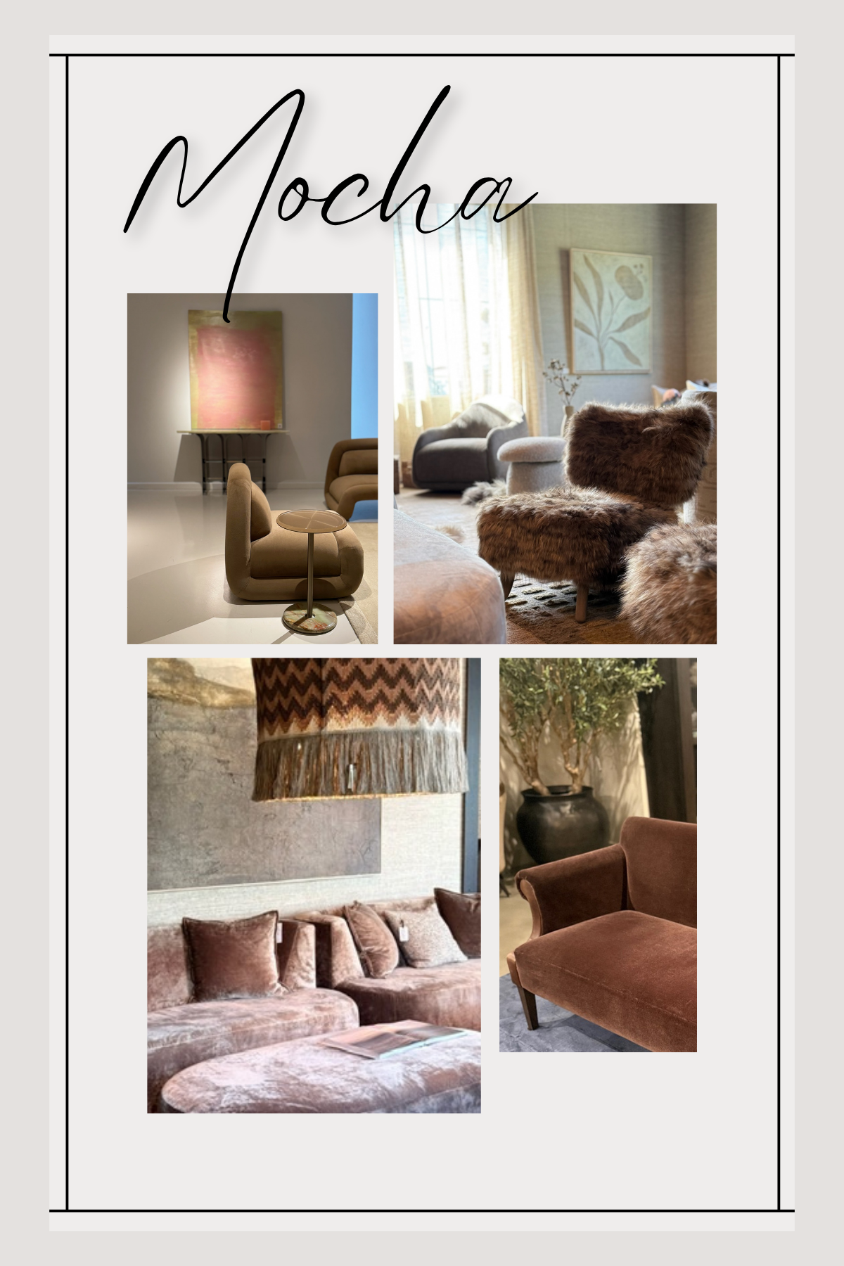
Mocha Is Having a Moment
The most immediate shift across the showrooms was color, specifically, a rich family of browns. Not the flat, safe browns of the past, but deeply layered tones ranging from milk chocolate to dark espresso. What makes this trend feel sophisticated rather than safe is texture: these pieces are upholstered in velvets, mohairs, and bouclés that give the color genuine depth and warmth.
After years of beige and greige dominating the market, this feels like a meaningful shift. Brown grounds a room in a way that pale neutrals simply can't. And when it's paired with the right textures and layering, it reads as current, not traditional.
Color and Pattern Are Back
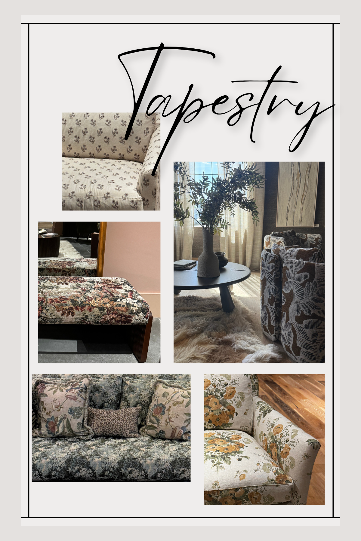
Very few showrooms this year leaned into all-neutral styling. Pattern is back, and it's bold. Block prints, large-scale florals, and wide stripes all made strong appearances. But the most consistent pattern across nearly every showroom was tapestry.
Tapestry is traditionally associated with heavy, formal interiors, but what I saw at High Point was something different. Tapestry upholstery on clean-lined, modern furniture. Statement chairs in intricate woven patterns paired with understated surroundings. It's a focal-point strategy, and it works beautifully. Seeing a tapestry chair where a plain tan sofa would have lived a few years ago says a lot about where the market is heading.
Traditional florals, the kind that bring to mind classic English chintz, also showed up in fresh colorways and updated fabrications, feeling more modern than nostalgic.
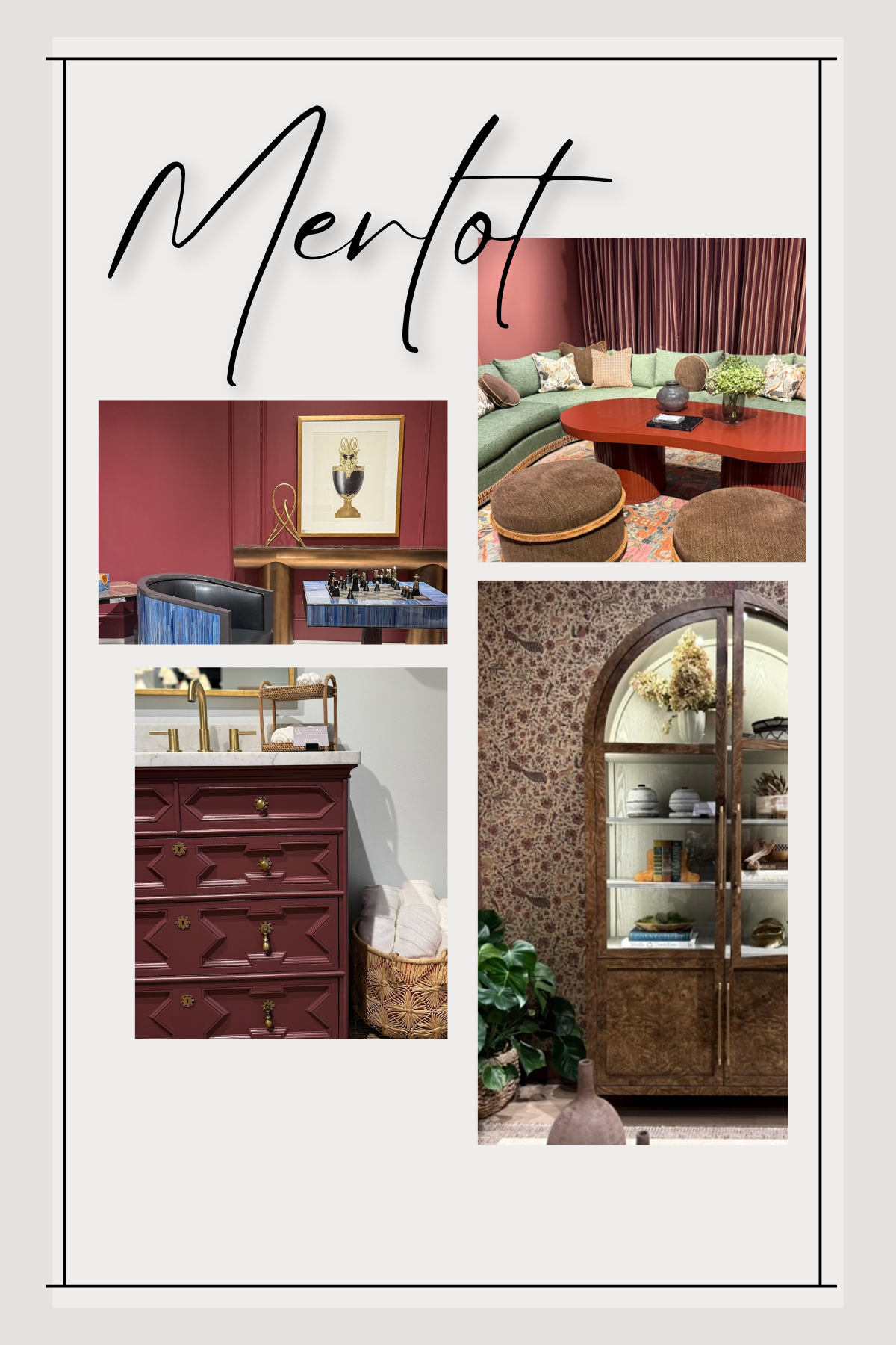
Red as a Statement Color
If there was one color that showed up in showroom after showroom, on walls, in upholstery, in art, it was red. Deep, rich, considered shades of red. Burgundy, crimson, brick. Not as an accent, but as a primary design statement.
This was particularly interesting given that the Pantone Color of the Year was announced as a shade of white. The market clearly had other ideas. Red commands a room, and designers are embracing that confidence right now.
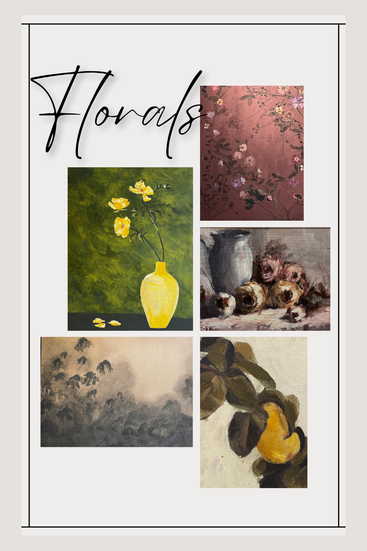
Art: Still Lifes and Moody Landscapes
The art leaned painterly and abstract. Still life compositions were everywhere, alongside loose, organic landscape paintings in those same deep, moody tones: ochres, forest greens, dusty roses, warm blacks. Nothing tight or photorealistic. The aesthetic is expressive, layered, and grounded. It complements the heavier textures and richer colors showing up in furniture and textiles.
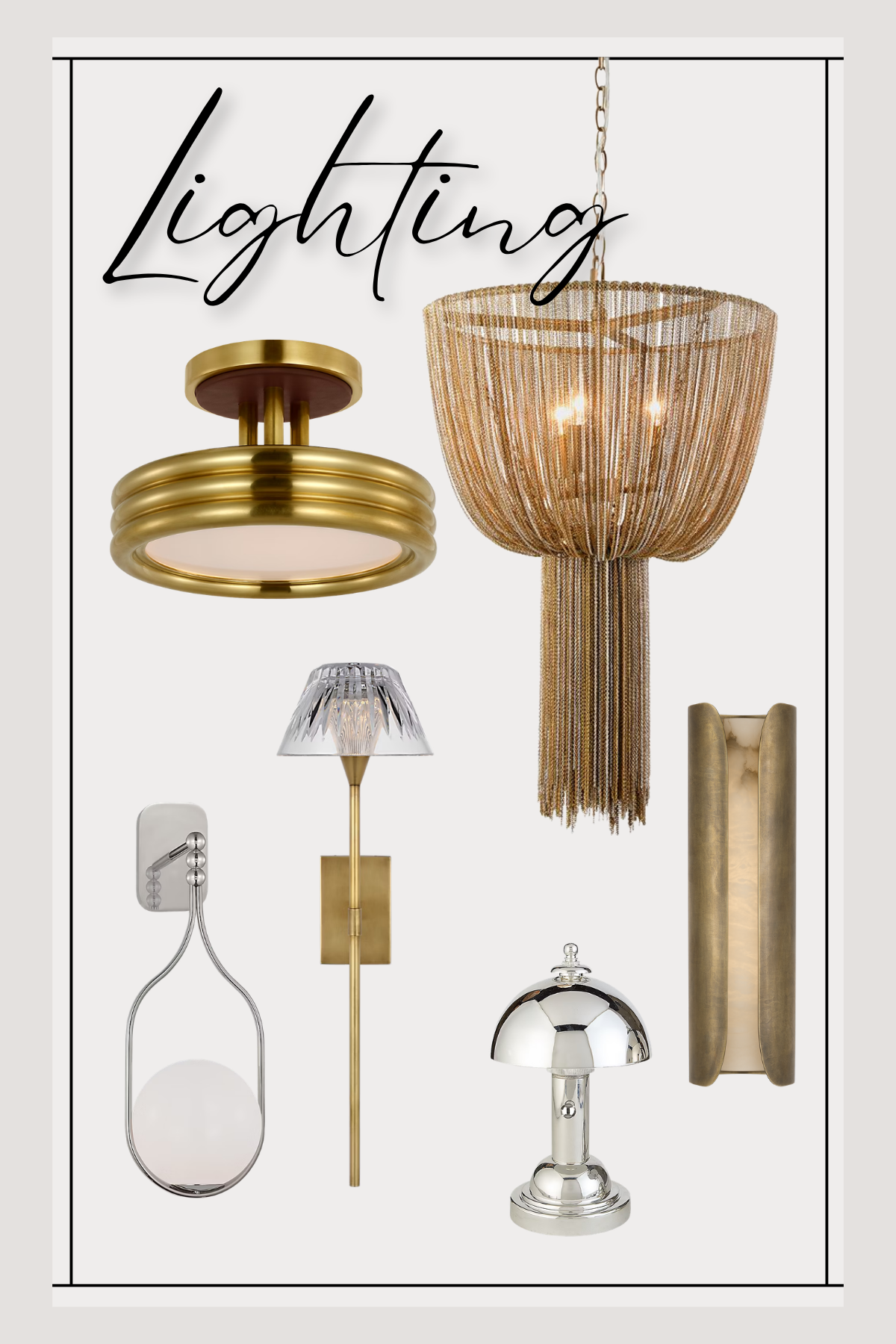
Lighting: Brass is Still Dominant, Nickel is on the Rise
Brass remains the dominant metal finish in lighting, no surprise there, as it's been the industry standard for several years. But I'm beginning to see a genuine uptick in polished nickel, which tracks with what designers in larger coastal markets have been specifying for a while now. Our regional market tends to adopt trends a bit later than the coasts, so seeing nickel gain real presence at High Point feels like a signal worth noting for clients planning longer-horizon projects.
What This Means For Your Project
The overarching story from High Point this spring is one of confidence. Confidence in color, in pattern, in statement-making. The design world is moving away from the safety of all-neutral everything and toward spaces that feel intentional and layered.
If you're in the midst of a project or planning one, this is a great moment to reconsider where you might add depth, a statement chair, a richly textured sofa, a bold art piece. These trends aren't fleeting; they represent a genuine shift in the design landscape, and they translate beautifully into residential spaces. I'd love to talk through what any of this could look like in your home.
Warmly,